Model Comparison - ROC Curves & AUC
INTRODUCTION
Whether you are a data professional or in a job that requires data driven decisions, predictive analytics and related products (aka machine learning aka ML aka artificial intelligence aka AI) are here and understanding them is paramount. They are being used to drive industry. Because of this, understanding how to compare predictive models is very important.
This post gets into a very popular method of decribing how well a model performs: the Area Under the Curve (AUC) metric.
As the term implies, AUC is a measure of area under the curve. The curve referenced is the Reciever Operating Characteristic (ROC) curve. The ROC curve is a way to visually represent how the True Positive Rate (TPR) increases as the False Positive Rate (FPR) increases.
In plain english, the ROC curve is a visualization of how well a predictive model is ordering the outcome - can it separate the two classes (TRUE/FALSE)? If not (most of the time it is not perfect), how close does it get? This last question can be answered with the AUC metric.
THE BACKGROUND
Before I explain, let’s take a step back and understand the foundations of TPR and FPR.
For this post we are talking about a binary prediction (TRUE/FALSE). This could be answering a question like: Is this fraud? (TRUE/FALSE).
In a predictive model, you get some right and some wrong for both the TRUE and FALSE. Thus, you have four categories of outcomes:
- True positive (TP): I predicted TRUE and it was actually TRUE
- False positive (FP): I predicted TRUE and it was actually FALSE
- True negative (TN): I predicted FALSE and it was actually FALSE
- False negative (FN): I predicted FALSE and it was actually TRUE
From these, you can create a number of additional metrics that measure various things. In ROC Curves, there are two that are important:
- True Positive Rate aka Sensitivity (TPR): out of all the actual TRUE
outcomes, how many did I predict TRUE?
- \(TPR = sensitivity = \frac{TP}{TP + FN}\)
- Higher is better!
- False Positive Rate aka 1 - Specificity (FPR): out of all the actual FALSE
outcomes, how many did I predict TRUE?
- \(FPR = 1 - sensitivity = 1 - (\frac{TN}{TN + FP})\)
- Lower is better!
BUILDING THE ROC CURVE
For the sake of the example, I built 3 models to compare: Random Forest, Logistic Regression, and random prediction using a uniform distribution.
Step 1: Rank Order Predictions
To build the ROC curve for each model, you first rank order your predictions:
| Actual | Predicted |
|---|---|
| FALSE | 0.9291 |
| FALSE | 0.9200 |
| TRUE | 0.8518 |
| TRUE | 0.8489 |
| TRUE | 0.8462 |
| TRUE | 0.7391 |
Step 2: Calculate TPR & FPR for First Iteration
Now, we step through the table. Using a “cutoff” as the first row (effectively the most likely to be TRUE), we say that the first row is predicted TRUE and the remaining are predicted FALSE.
From the table below, we can see that the first row is FALSE, though we are predicting it TRUE. This leads to the following metrics for our first iteration:
| Iteration | TPR | FPR | Sensitivity | Specificity | True.Positive | False.Positive | True.Negative | False.Negative |
|---|---|---|---|---|---|---|---|---|
| 1 | 0 | 0.037 | 0 | 0.963 | 0 | 1 | 26 | 11 |
This is what we’d expect. We have a 0% TPR on the first iteration because we got that single prediction wrong. Since we’ve only got 1 false positve, our FPR is still low: 3.7%.
Step 3: Iterate Through the Remaining Predictions
Now, let’s go through all of the possible cut points and calculate the TPR and FPR.
| Actual Outcome | Predicted Outcome | Model | Rank | True Positive Rate | False Positive Rate | Sensitivity | Specificity | True Negative | True Positive | False Negative | False Positive |
|---|---|---|---|---|---|---|---|---|---|---|---|
| FALSE | 0.9291 | Logistic Regression | 1 | 0.0000 | 0.0370 | 0.0000 | 0.9630 | 26 | 0 | 11 | 1 |
| FALSE | 0.9200 | Logistic Regression | 2 | 0.0000 | 0.0741 | 0.0000 | 0.9259 | 25 | 0 | 11 | 2 |
| TRUE | 0.8518 | Logistic Regression | 3 | 0.0909 | 0.0741 | 0.0909 | 0.9259 | 25 | 1 | 10 | 2 |
| TRUE | 0.8489 | Logistic Regression | 4 | 0.1818 | 0.0741 | 0.1818 | 0.9259 | 25 | 2 | 9 | 2 |
| TRUE | 0.8462 | Logistic Regression | 5 | 0.2727 | 0.0741 | 0.2727 | 0.9259 | 25 | 3 | 8 | 2 |
| TRUE | 0.7391 | Logistic Regression | 6 | 0.3636 | 0.0741 | 0.3636 | 0.9259 | 25 | 4 | 7 | 2 |
Step 4: Repeat Steps 1-3 for Each Model
Calculate the TPR & FPR for each rank and model!
Step 5: Plot the Results & Calculate AUC
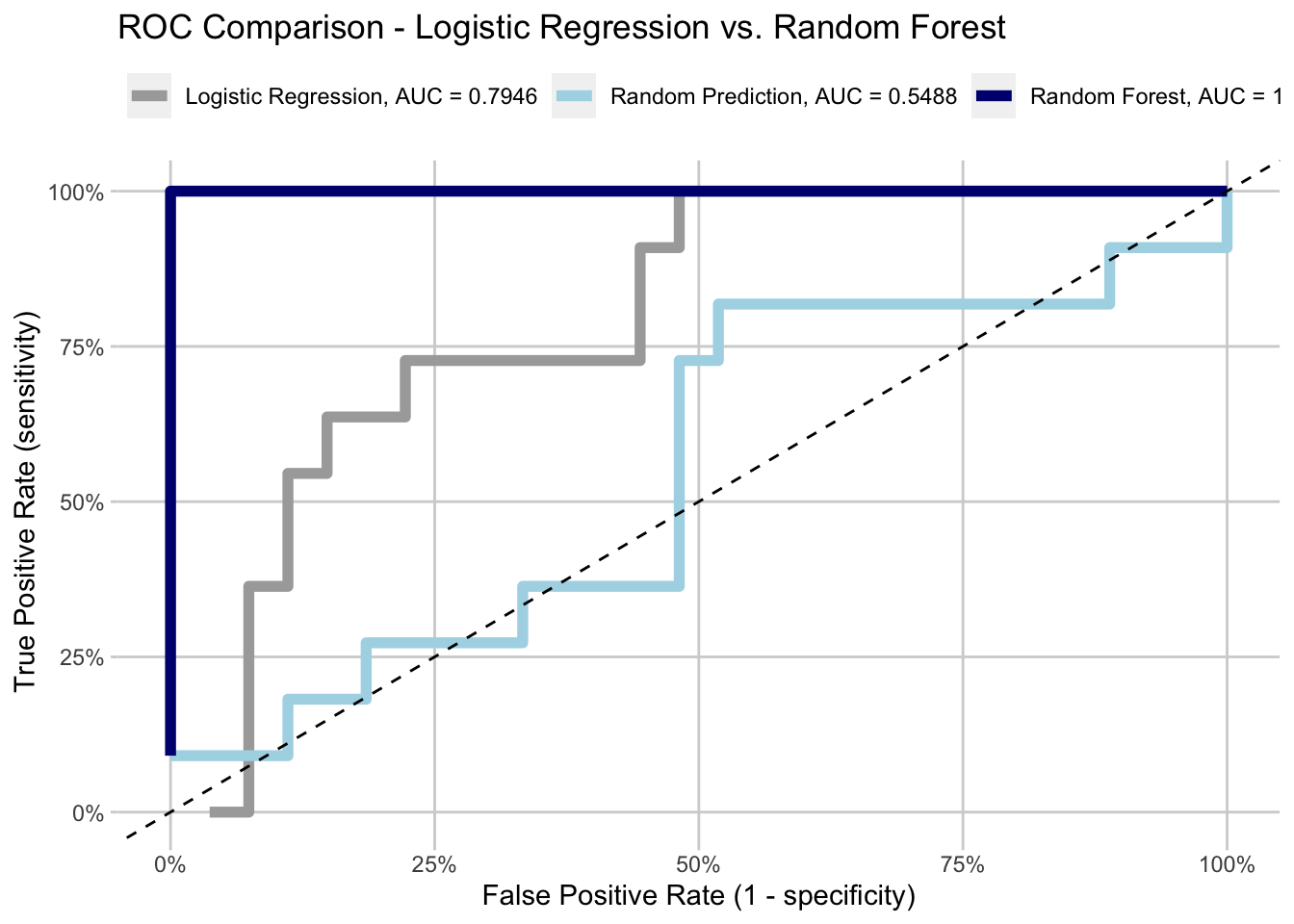
As you can see below, the Random Forest does remarkably well. It perfectly separated the outcomes in this example (to be fair, this is really small data and test data). What I mean is, when the data is rank ordered by the predicted likelihood of being TRUE, the actual outcome of TRUE are grouped together. There are no false positives. The Area Under the Curve (AUC) is 1 (\(area = hieght * width\) for a rectangle/square).
Logistic Regression does well - ~80% AUC is nothing to sneeze at.
The random prediction does just better than a coin flip (50% AUC), but this is just random chance and a small sample.
SUMMARY
The AUC is a very important metric for comparing models. To properly understand it, you need to understand the ROC curve and the underlying calculations.
In the end, AUC is showing how well a model is at classifying. The better it can separate the TRUEs from the FALSEs, the closer to 1 the AUC will be. This means the True Positive Rate is increasing faster than the False Positive Rate. More True Positives is better than more False Positives in prediction.